Quilts for Sale

Tuesday, July 31, 2012

Fresh Versions of Modern


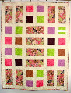
jill here....Sometimes we're lucky enough to see someone else's versions of our patterns.  We love it when customers send us photos of their interpretation! The neon pastels appear luminous as they skip across the surface of this small scale dark print background.

Oliver guarding Glendia's Leftovers!
Think it will ever be cool enough to enjoy
the warmth of this quilt?

Brioche and Baguette sent from Candy
at Orange Quilt Bee.
Facebook fan Susan sent us her new TV Dinner sample.
It was made for Quilts Ole
which will be hosting one of our trunk shows very soon.

Special delivery to Rob!   Hot of the press, our friend
Jane, created this striking Recipe Cards.
Check out the toes.
To use all her wonderful fabrics,
Jane backed the quilt with squares set similarly to
Brioche and Baguette.
It's a twofur!
Hope you have a great Tuesday...'till then!

Tuesday, July 24, 2012

Pink Chalk and Facebook and Pinterest, Oh My!

Marny here...


Marny's photo as seen on Where We Sew for Pink Chalk
So much to share today.  First did you see my sewing space on Pink Chalk's Where We Sew yesterday?  Check this link if you want to read what I had to say.  Leave a comment for a chance to win a gift certificate.

If you've read recent posts you might remember that I lucked out and had my space all tidied up before Kathy Mack approached us to join her Where We Sew month.  You can see that here.  I have to admit that I did take the opportunity to make mine even a bit prettier for the Where We Sew event.


Jill's photo as seen on Where We Sew for Pink Chalk

Jill's sewing studio is on the agenda for today.  Go see it here.  Jill enjoyed having Kathy's invitation as added motivation.  And you can see her transformation post here.


There is a Where We Sew Pink Chalk button in the righthand column of our blog you can use to explore lots of sewing studios, to even post a photo of you own space, and remember to leave comments to win a gift certificate for patterns and fabric!  Yes, let me say again, please comment on our sewing spaces!  We love reading notes from out friends, old and new.

Now for more big news.  We are up and running with Facebook and Pinterest.  Please check us out and Like and Pin away!!!  You can use the Facebook tab in the bar above and the Pinterest button on the right.  We can't wait to hear from you.  We know lots of you use Facebook and Pinterest already.

We want to give credit where credit is due!  Many thanks to Samantha Boyd and her business Zao525.  Here is their Facebook page.  She and her partner, Melissa Miller, are in the business of helping small businesses establish their voice through the many layers of branding and marketing.  We were never going to carve out the time to learn about and to set up a professional identity using social media so we went to some experts!  Now we have to practice and catch the wave.  Have fun checking out their website and Facebook page.  They are delightful.

So hope hear from you over on Facebook and Pinterest.

Till Tuesday....

Tuesday, July 17, 2012

Modern Studio Makeover


jill here....When the email came from Kathy Mack about "studio photography" I knew I had to get my domain in shape.  Marny had laid down the challenge with her clean space and my space was a disaster!  It was time.  And there was a deadline on the horizon. Not only was it clean up but clean OUT with some fabric that time would never allow me to use.  I really have learned that as much as I love what I have purchased, there is always more wonderful fabric coming out.  And what we use right now for design is never the right amount from my stash!

I had forgotten what I was supposed to learn in kindergarten....
put it back where you found it!

What I used from this shelf most frequently was the fabric.
Patterns and colored pencils, bias tape, elastic could all find a new home.

Crazy, lazy....

My helpers right under foot!
So I sorted and pitched, cleaned and rearranged.....
These 2 sheets of "Celotex" covered in batting are lightweight and movable.
Don't know how I could work without them!

This is my ancillary room that supports my Megaquilter.
HMMMM.  And a stack of  ready to be quilted tops.
Check back.
 If they're not done before January, they will be in some one else's hands!

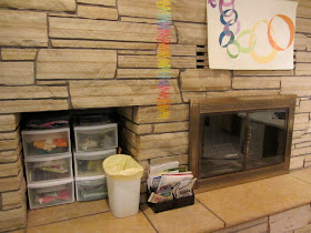
Now that I can see the fireplace, I'll have to enjoy with some candles.
Perhaps when it cools down.
The cubby intended for firewood is perfect for current projects.

Fabric sorted, back-up irons (gifts from kids who don't iron),
bags on top, neatly folded.  My TV , utilized more as a radio, is
located to the right so I can look up and watch the finished room
on HGTV ...or some new food idea.
A comfortable chair with the sewing table that my husband built.
It overlooks the "big board" ironing board and the very large cutting table.
This is my circle as it makes me get up an move from one station to another.

I even organized the  bullitin  board.

Book shelves.  New rule is they have to fit or they find a new home
with someone who will enjoy them.
So here's the finished product...

I switched out the actual iron board support for shelving.
And it's not even full yet.
Just have to remember where I put stuff.
  'Till next Tuesday,....


Tuesday, July 10, 2012

Atkinson Designs' Bridget's Bagettes (not our Brioche and Baguette :-)

Marny here...Terry Atkinson recently came out with Bridget's Bagettes.  I saw some samples at Quilt Market and was hooked.  Making one became a priority when the need for a birthday gift presented itself.  I also seem somewhat stalled with designing and sewing on my own, so following a well written pattern and completing something seemed like a good idea.       

Cute little pattern by Atkinson Designs.
Sewing seemed appropriate on a scorching Fourth of July.  This aqua zipper was the only one I had on hand of the right length.  Luckily really cute coordinating fabric was sitting on my fabric shelves.  Of course everything was so easy to find since my sewing studio is currently clean!  

Making two can't take much longer than making one, right?  Don't ask me if I finished the second one yet!  Afterall the chips and guacamole and great sweet corn needed my attention too. 

This is the medium Bagette.  Cute as could be.  VERY clever zipper insertion and construction method.
So this is now my current favorite bag pattern!
What are some of yours?

...and I was right.  Sitting down at the sewing machine, cutting and choosing fabrics, etc. has all served to get my creative juices flowing!  Sometimes you just have to dive in ready or not.  

Till Tuesday...


Tuesday, July 3, 2012

The Positive of the Negative in Modern Quilt Design

jill here...okay, I'm running late today.  Why is it that everything seems to take longer than planned?  Once Marny got her studio all cleaned up, I just had to rise to the occasion.  Then Kathy Mack asked us to show a photo of "where we sew" for her blog so that meant real business!  I been busy with that cleaning thing! The tab at the top will link you to Pink Chalk's Studio tour.  Needless to say, we'll keep you posted as to when we're on.  Did you know its really hard to sew in a clean space?  Well, sort of...

You'll note that this week's blog is a follow up from last week's start using the "Learning Curve".
 I went to Linda's site and her description of how to sew the curve.  She sews with the larger piece on top (different from my tutorial).  I tried it and had better success with the smaller convex piece on top.  Just goes to show you, there are lots of ways to get from point A to B.  Testing curves and finding your comfort zone is important.

So this little experiment was constructed to help understand negative space.  Designing is always a learning experience for me, so I'll share some of the process.  Negative space is the space that is not the subject.  In our designs, we like to use a lot of negative space.  It gives the eye a place to rest and brings emphasis to the subject.  It's our interpretation of modern...clean and uncluttered.  In this case, the subject is the quarter curve.  The background  and subject color changes, moving the focus.  Originally, I had fabricated some of the blocks with a high contrast analogous print. I decided the print demanded so much attention that it was distracting to the basis of the design.  So I moved ahead with white, yellow and two other values or orange and yellow orange.  The idea was to create a small project; one that  suggested circles with some negative spaces left to the imagination.

This shows adding the true orange.  It seemed overpowering
 in the background position.  It was voted off the island.
Did you know that a little yellow goes a long way.  I love yellow, its happy and bright but it seems effective in smaller doses.  The yellow oranges  and orange help "tone" it down.

Testing out other settings...this one seems too balanced with a
focus in the middle, too predictable, maybe too sketchy.

Moved the focus from the center and added one more yellow background,
distributed the orange value, engaged two edges.  Time to call it good and sew together.
These curves are not quarter circles so decided to add sashing...
another opportunity.

Entertained the idea of using one of these prints as a sashing.
Decided it would be about line and not negative space.
Voted to use the white as the sashing


Completed (or not) project with 1" finished sashing.
It's a strange size but I like the sketchy puzzle.
There are lots of opportunities for the quilting thing.
Any ideas on how to quilt?  Let's talk before next Tuesday (meaning I'd like to hear your opinions)!