Quilts for Sale

Tuesday, February 23, 2016

Jane Sassaman's Leaf Dance Fabric from Free Spirit

jill here...One of the best parts of quilt market is meeting creative designers face to face.  Jane Sassaman is truly a wonderful quilt artist and a very nice person! She grew up in Ames, Iowa and is an ISU graduate, but we would have liked her anyway!  One of her books, The Quilted Garden, is inspirational for any artist regardless of the medium.  Her journey is honest and  accomplished.

The Quilted Garden published by C and T in 2000.
We've always admired her designs in quilts and fabric: they are colorful, graphic and bold in scale. When we spied her new line Leaf Dance we instantly fell in love.  Free Spirit was very generous to share....

The periwinkle collection of Leaf Dance.
I had been experimenting with a block design that I thought would be perfect using 2 color ways.  When the fabric arrived, I changed my plan.  The fabric is complex and sophisticated; the MQR pattern design needed to be simpler to feature the beautiful fabric textures and prints.

An absolutely wonderful stripe, coral textural, and dots....
used in the supporting roles!

Larger scaled organic shapes, oak leaves and wonky equalateral triangles...
used in the featured rectangles.


 Experiments using the stripe (2 different color ways )
 separated with a white background...

ultimately too distracting.


 A glimpse of the finished product ready for submission....


'till next Tuesday....


Tuesday, February 16, 2016

Transparency for Quilters Part 2


Marny here...with half of the color & value transparency workshop we held last month for the Des Moines Area Quilters Guild. Refer here for the first post. Special thanks to Eva, Karen M., Deb, Karen P., Jill M, Kristen, Karen S., and Diane! This time we used the easy and flexible Crispy Wonton block from our book, Quilts du Jour.


5 values of a warm analogous color scheme

5 values of a cool analogous color scheme.
Love the sunny ocean palette!

5 values of an analogous color scheme.
Orchids anyone?

5 values of a cool analogous color scheme, looks like an angry sea in spots.
5 values of an analogous color scheme, ferns and new leaves!


Three values, addition of stripe mixing the light and dark to make "dark",
all lighter than the background. An interesting direction.
Work in progress, experimenting with values and prints and layout.
It was a good learning experience for everyone! 

Eva's final layout, beautiful matchstick quilting added.
A shout out to Jacquie Gering's
Creative Quilting with Your Walking Foot class on Craftsy.
Gorgeous!

Till Tuesday...


Tuesday, February 9, 2016

Jane's Pillows

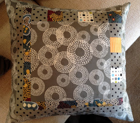
jill here....Our friend Jane got creative and made some new pillows for her daughter! She used our Nibbles pattern and enlarged it in a half -log- cabin- way.  The warm grey really allows those niblets to pop.
Jane's four little pillows all in a row!

A great mix of fabrics...and a cute black dot to add depth...

And the accent strip on the envelope back makes it fun to flip.
You're a smart cookie, Jane.

"More is more" in this rendition of changing scale.


Maybe they could stay in Iowa.  I know a good home....


Thanks for sharing, Jane!  until next Tuesday....

Tuesday, February 2, 2016

Transparency, Color and Value for Quilters

 Marny here...blizzard in progress outside my window. Even the birds are visibly hanging tight to the feeders this morning. Their little 'toes' are working hard.

Here is a peek into one half of the Value and Color Transparency workshop we held for the Des Moines Area Quilters Guild last week. It was just part of a wonderful three days with the guild!
The Sushi Block, in our book Quilts du Jour, demonstrates transparency within the block. (book available as indicated in side bar) 
Students brought solids or prints in a specified range of values.
What happened next was AMAZING! 


Jill M's block with the light in the large rectangles, the medium forming
the "intersection" of light with dark, and the dark transversing the gray background. Lovely and quiet. Perfect for a baby!

Kristen's block uses the values in different positions.
Now the light is transversing the background, the medium is used for
the large rectangles and the dark is the "intersection"
of the light and the medium. Great job! 

Karen's block is so pretty! Shot cottons are stunning in transparencies.
Her values are placed in the same positions as the yellow one above.

A textured tone on tone is used here for Diane's medium.
It is yet another possible arrangement of values.
The light is used in the large rectangles, but this time the dark is the intersection with the medium transversing the background.
Karen nailed using prints!  

Look at Eva's use of a stripe, colors and value in her transparency project. The stripe literally pulls the orange across the pink. Fun!

Deb scored big! Luminosity and transparency with her use
 of dull and bright, dark and light.
Thank you to our students and to the Des Moines Area Quilters Guild for having us!
till Tuesday...