SIMPLY SOPHISTICATED DESIGN WITH A TASTE OF THE UNEXPECTED.

Tuesday, February 16, 2016

Transparency for Quilters Part 2


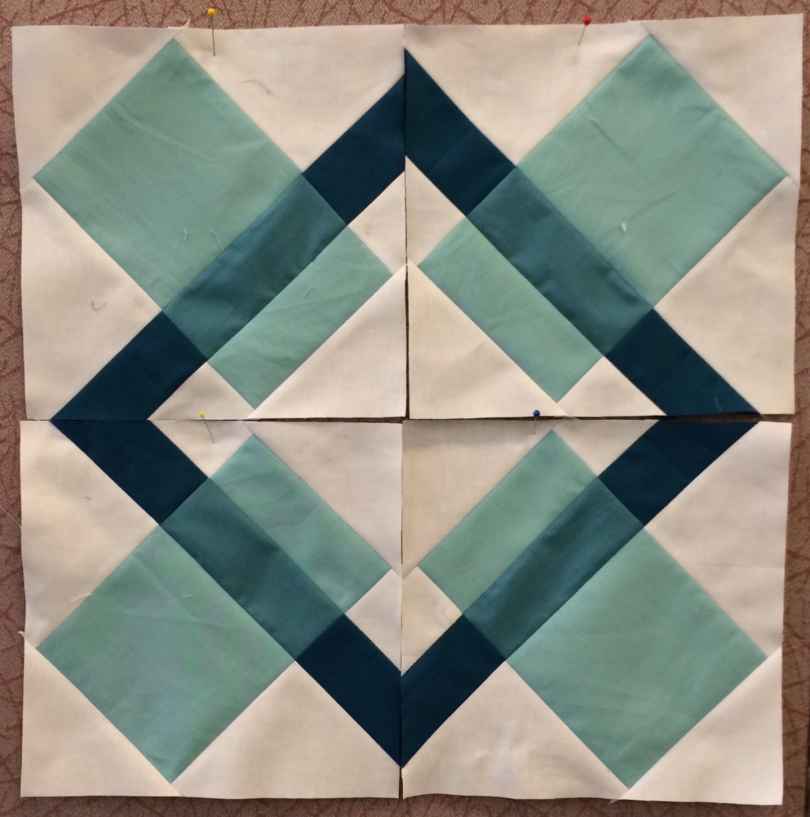
Marny here...with half of the color & value transparency workshop we held last month for the Des Moines Area Quilters Guild. Refer here for the first post. Special thanks to Eva, Karen M., Deb, Karen P., Jill M, Kristen, Karen S., and Diane! This time we used the easy and flexible Crispy Wonton block from our book, Quilts du Jour.


5 values of a warm analogous color scheme

5 values of a cool analogous color scheme.
Love the sunny ocean palette!

5 values of an analogous color scheme.
Orchids anyone?

5 values of a cool analogous color scheme, looks like an angry sea in spots.
5 values of an analogous color scheme, ferns and new leaves!


Three values, addition of stripe mixing the light and dark to make "dark",
all lighter than the background. An interesting direction.
Work in progress, experimenting with values and prints and layout.
It was a good learning experience for everyone! 

Eva's final layout, beautiful matchstick quilting added.
A shout out to Jacquie Gering's
Creative Quilting with Your Walking Foot class on Craftsy.
Gorgeous!

Till Tuesday...


Tuesday, February 9, 2016

Jane's Pillows

jill here....Our friend Jane got creative and made some new pillows for her daughter! She used our Nibbles pattern and enlarged it in a half -log- cabin- way.  The warm grey really allows those niblets to pop.
Jane's four little pillows all in a row!

A great mix of fabrics...and a cute black dot to add depth...

And the accent strip on the envelope back makes it fun to flip.
You're a smart cookie, Jane.

"More is more" in this rendition of changing scale.


Maybe they could stay in Iowa.  I know a good home....


Thanks for sharing, Jane!  until next Tuesday....

Tuesday, February 2, 2016

Transparency, Color and Value for Quilters

 Marny here...blizzard in progress outside my window. Even the birds are visibly hanging tight to the feeders this morning. Their little 'toes' are working hard.

Here is a peek into one half of the Value and Color Transparency workshop we held for the Des Moines Area Quilters Guild last week. It was just part of a wonderful three days with the guild!
The Sushi Block, in our book Quilts du Jour, demonstrates transparency within the block. (book available as indicated in side bar) 
Students brought solids or prints in a specified range of values.
What happened next was AMAZING! 


Jill M's block with the light in the large rectangles, the medium forming
the "intersection" of light with dark, and the dark transversing the gray background. Lovely and quiet. Perfect for a baby!

Kristen's block uses the values in different positions.
Now the light is transversing the background, the medium is used for
the large rectangles and the dark is the "intersection"
of the light and the medium. Great job! 

Karen's block is so pretty! Shot cottons are stunning in transparencies.
Her values are placed in the same positions as the yellow one above.

A textured tone on tone is used here for Diane's medium.
It is yet another possible arrangement of values.
The light is used in the large rectangles, but this time the dark is the intersection with the medium transversing the background.
Karen nailed using prints!  

Look at Eva's use of a stripe, colors and value in her transparency project. The stripe literally pulls the orange across the pink. Fun!

Deb scored big! Luminosity and transparency with her use
 of dull and bright, dark and light.
Thank you to our students and to the Des Moines Area Quilters Guild for having us!
till Tuesday...

Tuesday, January 26, 2016

One Challenge Solved!


jill here...Well I'm happy to report that sometimes I  learn from my errors.  While Marny and I were preparing for our upcoming Des Moines Quilt Guild presentations, I had a light bulb moment!  Marny's notes, concerning transparency, are explicit concerning the line (or shape) of implied intersection. I was confusing the total design with the intersecting line.

The large blocky stripes do not represent the intersecting lines 
of the gold, rust and green. The value and colors

are believable, the shape is not.

Using leftover triangles of the three colors and background...
 I blocked out the large rectangles and
the intended line of interaction became more apparent.

Believable now?
The second rule that I needed to remind myself was that "Less is More"!  I attempted using too many colors.  Live and learn but worth the challenge.

'Till next Tuesday....

Tuesday, January 19, 2016

The Value of Trial and Error

jill here...thanks again for all your thoughtful comments.  We appreciate them and know they will be helpful in our teaching endeavors.

Are you staying warm?  At least here in Iowa there is exciting basketball to view ....and the never ending TV sports venue of football championships,  a little Aussie tennis and way too much in the political arena. Glad for the days getting longer.

In preparation for our upcoming workshops, I'm working on some samples.  I showed you an earlier struggle and today I have another challenge.  I promise I will follow up with both solutions after our DSM presentation.  Working through the constraints will make me a better teacher!  Right?

For the transparency workshop, we're going to make a table topper from the book's Crispy Wonton block pattern. I need 5 solid values and a background.  Seems like my selection of greens is the largest so a good starting point.

 Six solid values plus a dark green background.

Auditioning six values on a print that are
perfectly coordinated with the values.

Too much competition for the focus blocks.

Now it's seven values on a black background.

.....on a white/black graphic nondirectional print

....on a small grey houndstooth print

...on a light nondirectional text print

I decided on the houndstooth print and subtracted
the two values that are pulled up.
They seemed too close in value to the others.

The ultimate decision!

Yes, ombre fabric can work very well!
This McKenna Ryan fabric seems to
represent four values
.

First attempt with transparency overlap.

Different arrangement with the same blocks.
Seems a bit confusing.  Have to work on it.
 A photo is very helpful.


....I'll keep you posted. 'Till next Tuesday...

Tuesday, January 12, 2016

We have a winner!

Marny here...Last week we posed two questions. We thank you for all your thoughtful answers; they will serve to make us better teachers! You came up with all sorts of great ideas for classes!

Your answers support our decisions about the workshops we are offering. One will be on Value and Contrast in quilt design along with reinforcing small projects. The other is Value and Color Transparency, explained and utilized in small projects.

Here are the original questions posed:
1. When you take a workshop or class (3-6 hours) do you prefer to learn more about a concept (ex. contrast and value) or actually follow a pattern and work on a quilt?

2. What concepts or skills interest you?


We received 21 comments. Classes offering design concepts and/or techniques won overwhelmingly. Many concept proponents mentioned they'd like the concepts reinforced in a small project that could be completed, or nearly finished, during the workshop. 

Total for working on concepts - 15
Total for working on pattern in class - 5
Total requesting both - 1

Concepts brought up:

  • design concepts including color, value, impact
  • concepts needed to design a pattern
  • color concepts to help make difficult choices easier
  • concepts to help create, make and build quilts
  • modern quilt design
  • improv piecing (both as a concept of a technique)
  • color theory
  • design process
  • collage quilting, what makes a good collage
  • choosing best quilting pattern for a completed quilt
  • embellishing 
Techniques mentioned:

  • y-seams
  • efficiency tips
  • hints on making challenging blocks easier ("V" example)
  • speed or shortcut skills
  • tips to customize a pattern without impacting the integrity of the designer's intent
  • sewing room organization 
  • Curved piecing
  • Free motion quilting
  • Applique
  • Piecing techniques
I want to thank everyone who commented once again. Your answers were intriguing and challenging.

Ok then, time to pick a winner. 
Screen shot of the random number generator's pick
Our winner is Sonja! We'll try reaching you now, but if the email is a problem please email us with your two pattern choices and we'll get them into the mail for you!

till Tuesday...


Tuesday, January 5, 2016

A Pattern Giveaway for Your Thoughts

Marny here...  Today is the first Tuesday of 2016. The new year feels fresh and full of potential. I've got an inspiring new planner in hand and a variety of goals bouncing around in my mind. 

The Get To Work Book from Elise Blaha Cripe seems a perfect fit for me. I love graph paper, vertical columns for to do lists, room to color and doodle, and planning sheets. Its size and shape dictates it will stay at home on my desk or work table ready to be used. Elise offers down to earth, realistic videos covering uses for the planner.  Her single sheet 2016 Goal Tracker intrigued me too. It could be used for any goal you hope to work on daily.


So on the subject of planning, Jill and I met yesterday to map out the months ahead. We are working on lectures and workshops/classes. We'd like to pose a couple of simple questions.

1. When you take a workshop or class (3-6 hours) do you prefer to learn more about a concept (ex. contrast and value) or actually follow a pattern and work on a quilt?

2. What concepts or skills interest you?

Leave your comments answering the two questions by midnight Monday, January 11, 2016. The winner will be chosen using a random number generator and will get to choose any two of our patterns. We apologize, but due to international postal costs, giveaway open to US readers only. 

Till Tuesday...