

jill here...Within the past few years, I've become a fan of works by Anni Albers. She was a German American artist, working mostly in textiles and later in printmaking. She studied at Bauhaus, Germany with many other modern artists, married Joseph Albers and together they immigrated to the US in the 1930s, prior to the war. The Museum of Modern Art in NYC has a collection of her textiles and prints.
I'm intrigued with Alber's line work and it's applicable translation to quilt making. The juxtaposition of the lines is interesting; some lines are sharp contrast, others subtle with their stops and starts. I found the exploration of these lines similar to the designs in our pattern Torte, totally dependent on the arrangements of the blocks. So when I made some blocks for " You Want A Piece of Me?", I utilized some of the line work.
Size and Color were our challenges; one side of the block had to be 9.5" (unfinished) and the color was chosen by the recipient. This first fabrication explored the color acid green. I was lucky that Penny shared some of her private, hand dyed collection so that I could get it right! We could add any other supporting colors to the arrangement. So I thought I'd punch it up with some orange!

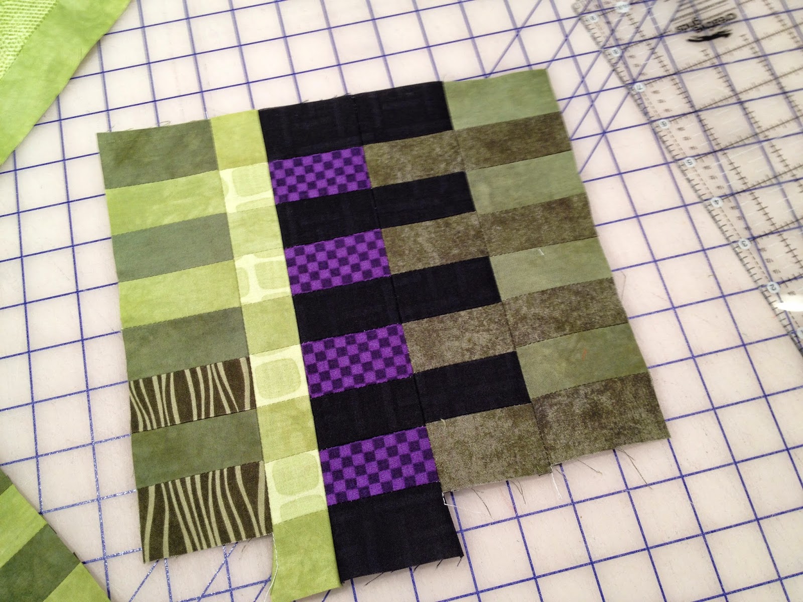
- 1 1/2 " strips cut from a WOF / cut in half to yield 2 strips. Combine it with another value or color to make a strip set of 4. Four strips in a set are easier to work with as you can turn them either direction (to use fabric A on top or fabric B on top).

 n
n- When you use one value, use it again in another combination.
- Use very dark and light values with discretion.
- Use very saturated, bright colors with discretion.


- Maintaining a horizontal orientation, I cut 3 1/2" pieces. I used this measurement because it was 1/3 the size of the finished block so seemed like an appropriate choice.....but later chose to cut a strip or two down to 1 1/2" wide. Some were larger for variety.

Three combinations that utilize in common values.
Less is more...more was just too much for this small composition.

The finished block!


Some transparency was achieved. The balance was countered diagonally .
'till next Tuesday....
I'm interested in what happened to the orange (3rd paragraph, last sentence). Like the design, but it seems heavy. Love the transparency.
ReplyDeleteGreat question on the orange. It seemed just too strong and saturated for the relatively small block. Perhaps if there had been more blocks the bright could have worked in to spark it up. I appreciate the comment, jill
ReplyDelete