SIMPLY SOPHISTICATED DESIGN WITH A TASTE OF THE UNEXPECTED.

Tuesday, April 26, 2016

Piecemakers Quilt Guild Galesburg, IL

Marny here...reporting on another wonderful guild speaking and teaching engagement. This time we were off to Galesburg, Illinois to visit the Piecemakers Quilt Guild. Thursday night we spoke about Quilts du Jour, our design aesthetic, and some of the nuts and bolts of our buisiness. The guild members were an attentive and interactive audience. We really appreciate being asked to speak! Here is their website and here is their Facebook page.
Transparent alternatives of the Sushi Block, using our book Quilts du Jour.
Friday we held an all day Value and Color Transparency work shop. We loved our time with a special group of students. In the morning we focused on making transparency happen within the Sushi block.


Three values of blue. Light and medium intersect to make dark.
Again three values, of violet.
Here light intersects with dark to make a medium. 
Three values of blue on a floral background.
Here light "arms" intersect with a medium large rectangle to create a dark.
Here we see green in three values.
The large rectangle and the plaid intersection are pretty close in value.
The background is a dark green. The plaid forms the intersection, drawing upon the light and dark greens on either side.
Three values in an analogous color scheme, one of them being the stripe. Medium "arms" plus a light large rectangle create the dark (stripe) intersection.
Doesn't it look like the green is drawing across the blue?
(The picture doesn't do it justice.)
Dark brown background grounds the cheerful orange units. The dark red-orange "arms" cross the lighter orange rectangles. A higher contrast stripe of oranges and brown, plus aqua and yellow forms the intersection. 
This "stripe" is fun! It has a bit more teal and more of an analogous navy background than is reflected in this photo.
I love that the layout of the blocks reiterates the line in the stripe itself!
So hard to tell in this picture, but the background is a light butter yellow that helps to make the stripe more believable.  The repetition of four blocks will be helpful too!


Making Lemonade from Sushi (?)! Follow the light orange horizontal line through the darker rectangles. Their intersection is the medium print. Great monochromatic transparency achieved!


Thanks again to the Piecemakers Quilt Guild and to our students!

Till Tuesday...


Tuesday, April 19, 2016

Keepsake Quilters Guild

jill here...Yesterday we spent a fun afternoon and evening with the Keepsake Quilters Guild of Cedar Falls.  Our transparency workshop was successful!

Ladies on task.
Sue happily sewing .

Sue's four blocks, checking out possible arrangements.

A collage of "first" blocks completed.

Fabrics from a completed
quilt inspired this arrangement.
Who doesn't like a pink
and grey combination?

Shared fabric (from Delphine)
for the successful overlay.


Batiks work beautifully.


Soft golds and browns
make for a mellow blend.
 Delphine took a risk with a directional background
and created a true color transparency.

                        
                       Black always adds a dramatic element.
Subtle textures create
some blending.


Taffy Twists
Tasty Measures

 During our break, we took a quick trip to the local Crazy to Quilt Shop.   Liz had several of our patterns as samples.  These were hung from the ceiling - how inventive !


Here's the group's "show and  tell".  Notice there were a couple of completions.
One had gone home at the break and started quilting.  What an inspiration!
Thanks, Keepsake Quilters for a great time.  'till next Tuesday....


Tuesday, April 12, 2016

DMMQG 2016 Challenge Part Two

Marny here...I have to admit this quilt challenge is going slowly for me. I posted previously about the very beginnings of my process.

I need to narrow in on three things: size, layout and fabrics to be used.
Here is a diagram working through three likely sizes for the finished quilt.
It is a little bit like Goldilocks and the Three Bears.
36" x 48" is too small and does not allow for enough negative space.
36" x 60" is too big a width to height ratio for the panels of print fabric.
36" x 54" is just right (for a starting point)! 

Now to start fiddling with layout and size of the print fabric panels on the proposed finished size diagram.  With some more fine tuning, I've decided 36" x 50" might be best. It seams to leave enough negative space at the top and bottom, and room enough for the panels. Now I can see the area where the three panels occupy the same vertical space. More overlap might be desirable for inserting the solid challenge fabrics. We'll see...

Simplest color scheme.
Using all the challenge fabrics on the front is not required.

The hot coral fabric added in.
All the challenge fabrics included. Cutting and testing is next!

Till Tuesday... 

Tuesday, April 5, 2016

Creative Paper Blocks

jill here...  Last week we had a repeat engagement where we spoke to sixty Iowa State University students. They explore different strategies and solutions in a Creative Thinking and Problem Solving class.  Most of the students come from the Apparel, Events, and Hospitality Management majors but there are a few from diverse disciplines. We shared creative components and how they apply to our design process and business model. We discussed constraints within our design/business models, showed some of our quilts and challenged the group with a design activity.

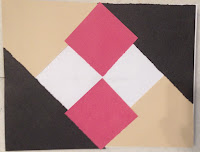
This year, we shared our trunk show as well as a traditional nine-patch (with nine patches, all equal in size, three different values) prior to the creative component.  The activity challenge: to design within constraints. They each had a paper selection of 3 values and a white sheet.  We asked them to create, by tearing the construction paper, another design.  The constraint was that they had to have nine pieces in the final composition and glue it down to a base sheet.  The time constraint was 20 minutes. The below designs are some of the "blocks" they produced.  Perhaps you will note some familiar renditions to the traditional.


Courthouse steps?
Diagonal lines

Folded corners create dimension

Similar to an argyle  

Bars and squares overlap

Interaction of lines and shapes

Modern asymmetrical chevron

Transparent images

Layers

Eggs for breakfast?

Creative textured background 

Interactive wedges
Constraints can be helpful.  In truth, we all face them.  'Till next Tuesday...