SIMPLY SOPHISTICATED DESIGN WITH A TASTE OF THE UNEXPECTED.

Tuesday, August 27, 2013

Modern Squares for Flatbread Tablerunner

jill here.... Sometimes color combinations inspire translation.  While shopping with my daughter in Nordstroms, I was exposed to not only styles I've grown out of but new color combinations !  I'm so excited to see a resurgence of navy.  With a pop of color, it's spectacular.


Our pattern "Flatbread"
creates the illusion of transparency.
The medium light citron intersects (or overlaps)
with the medium grey to form a third, darker value navy.
The snow background contrasts for a vary graphic interpretation.


Four colors (and values) are perfect for Flatbread.
From Kona cotton solids I chose :
Zucchini (I will call it citron),
Windsor (I will call it navy),
Medium grey and Snow.
The range of values is good but the light, dark and dull really sets off the citron.  The added bonus for graphic display is that they are all solids.


Another bonus is the solids display the quilting pattern,
which gives a very flat fabric depth and interest.
April added her touch with a pantograph called
"Modern Squares".

At rest in all this heat!


Stay cool.  'Till next Tuesday...

Tuesday, August 20, 2013

Fabric Dyeing: Under Penny's Tutelage


jill here.... On a very recent road trip to Galesburg, Illinois I met up with our Funquilters (more currently named Quilters By Design).  Most of these quilters are Chicago based but Penny, Knox College retired professor, was willing to share her fabric dyeing talents. Initially, we showed our newest projects with lively discussion and of course, there was delicious food!  What fun to have the love and support of this shared quilting adventure.  It's always interesting to hear other's opinions on how to solve design/quilting dilemmas;  years of experience pays off with the buddy system.  Great food for thought and not a calorie consumed!  Later in the afternoon, we began our dyeing instruction.

First off, we had to choose two or three colors .  There were four of us dyeing so the process potential bordered on a colorful circus.  Penny reigned us in, remained calm and offered us direction.


Largely influenced by a Carol Soderlund  workshop.
 Penny maintains notebooks with the recipes.
Mary Beth displays a swatch book :
this is one of three color reference guides
with the codes to create the colors. 
A page from the guide..
Janis contemplating color possibilities.
This is not an easy decision!

That's the perfect one!

After nourishment, we moved to the basement "wet studio". To help the process along, Penny soaked the laundered fabric in soda ash;  this changes the ph of the fibers to better accept the dye.


Sharon contemplates a bucket of soda ash.

Jill saving the soda ash solution for another day.

Penny begins the mixing.  It's a very accurate process
based on weight (the dye) and volume (the liquid) in
relationship to the amount of fabric being dyed. 


This is truly a test of math and science....
two of those subjects many of us try to avoid.
If high school had only used it in this context!


The application begins...

The massage is important for over all saturation!


Janis smiling through the 15 minute massage.
Her arms and hands had a workout with the indigo.


Sharon chose a slightly different process.  Penny assists folding
the extra large backing fabric.  


On top of the plastic covered ping pong table, they begin
pleating the fabric.  This will create vertical striations.

The fabric is scrunched to a manageable size (well, sort of).


Sharon began the dye application , starting with the blue.
She added a green and a teal to complete this design.
The coverage will have variation and bleeding of the analogous colors,
based on the folds and saturation.

The covered fabrics remained in their baths overnight.  In the morning, Penny rinsed the fabrics in preparation for the final cleansing.

The utility sink proves invaluable to these messy experiments.


Looks like it worked!


All the multicolored fabrics were rinsed and laundered together.
A small amount of liquid detergent was added to the
final wash/ rinse.
Once the fabric was slightly damp dried,  we operated
Penny's mangle.  A blast from my past, this creature
pressed it all in less than a minute.  Who said our mothers
weren't efficient?  

Sharon's whole cloth quilt!  TA DA!


Clothes line beauty in idyllic Galesburg.


Goddesses of beauty! 

Thanks, Penny for another addictive adventure!

Tuesday, August 13, 2013

Monaluna Free Range fabric

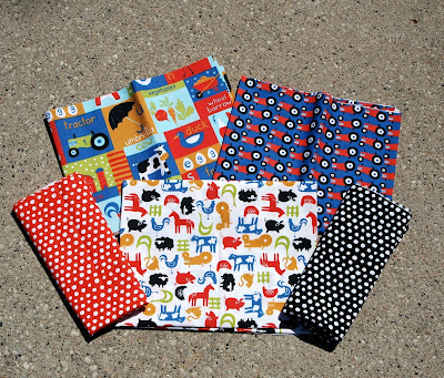
Marny here...whoopee!  The Free Range collection from Monaluna is shipping!  It is so cute!  Once again, Jennifer Moore has come up with a must have collection of organic fabrics.  Let me share what I just purchased for my personal use.  
First off, you have to love the way Jennifer and Hallie send out the orders.  Five one yard cuts wrapped with a slice from the collection and tied with baker's string.  A little thank you post card is included with a handwritten note on the back.  So sweet that you kind of hate breaking the pile apart.  But...
of course I broke it apart and here are the cute fabrics.  

Below are some better images of the individual fabrics taken from the Monaluna sight.  My photos don't do the fabric justice.

flat farm
Monaluna flat farm

apple barn cow
apple barn cow


tractors
tractors


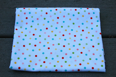
polka ott red
polka ott red

polka ott black
polka ott black

It will be fun to contemplate how the fabrics are going to get used!  Plotting and planning is more than half the fun.  Do you agree?

Till Tuesday...


Tuesday, August 6, 2013

Color Palettes for Patterns

Marny here...Today Jill and I got to take four quilts made from our two upcoming patterns out to April West's for quilting.  This is always lots of fun for us.  April knows her stuff.  The three of us discuss quilting lines, thread color, scale, etc.  And then we leave.  We're filled with anticipation waiting to see the quilt tops come to life with her quilting!

But in the meantime, we can show some of the fabrics we used.

Twelve fat quarters of Robert Kaufman Kona Colors in a range of neutrals.  There should be eight different fabrics, and four get repeated.  I was rushing the setting sun though, and I might not have gotten the assortment just right.  But you can get the idea.  Notice there is a range of values and warm and cool tones.

More Kona Colors.  These are slightly "off key" golds.  I love how they make the quilt better.  Wait and see.  Again different values and in a way, warm and cool again.
Even more Kona Colors.  Clearly using dark to light values again and the fabrics are a long way from matching one another.  Are you keeping track?  Eighteen fat quarters for the top of a good sized throw, including the binding.
Now for the next size of the same pattern.  Wish we could share the name, but it doesn't have one yet.  

This fabric was used in the child size.  We've used it before in projects and love it.  I've included the selvedge edge in case it is still available.

Six solid fat quarters added into the mix.  They are organic solids from Clothworks and have a nice tight weave.  Notice some pastel some not, some light and some dark.  Variety makes a difference!
Can't wait to share the actual quilts with you!

Till Tuesday...

Tuesday, July 30, 2013

Pickled in Citrus

jill here.... In the midst of family and new designs, some new samples have emerged.  This new baby is Pickle Relish fabricated in Cherrywood Fabrics. 


Modern Pickle Relish is designed with citrus solids
on a sunshine yellow background.


April West quilted  with orange thread
in an overall pantograph of connecting
squares and rectangles.
The scrappy binding finishes the playful mosaic. 

Happy quilting....'till next Tuesday!

Tuesday, July 23, 2013

Fresh ... and Still Not Rocket Science!

jill here....When Marny and I first started blogging, our first free tutorial was this "Not a Rocket Science Bag".  It was developed by using canvas as the structural base and a sew and flip technique.  Here are the original instructions; they are as good today as when they were developed! This bags sews quickly with not a lot of hop la!

My daughter recently requested a bag that could carry the duties of motherhood.  I added just a few features to make it easier to locate the cell phone and a front pocket for keys (or whatever).  The straps were extended to distribute the load and take the weight off the top of the bag.
"Not a Rocket Science Bag" designed  using some of
the Zen collection by Bridgit Hegland for United Notions.
This bag was designed using only 4 fabrics in the strip set, sewn with 1/2" seam allowances. The cut sizes are  4 1/2" for the top, followed by 6 1/2", 3 1/2" and 9" for the last. Much of this last fabric is the bag bottom so a dark value is helpful.  If you wish to make this bag, follow the original instructions with these changes.

Sew only the first fabric as instructed in the original tutorial if you want to add the cell phone pocket.  Once this top fabric is in place, fold the canvas side out (inside) with the fabric strip at the top.  Mark the 1/2" seam allowance on the outer edges. Determine the vertical center of each half; this is where the pockets will be centered vertically.

This is the padded cell phone pocket.
 Make a padded pocket that will house your cell phone.  This one finished 5" wide by 7" deep, with an inch or so extra on the top back side to sew to the canvas.  Center the pocket over where the seam allowance will be.....an eighth inch at the top will be sewn to the canvas side when the second strip is sewn to the right side of the bag... .  Once this is sewn, fold up and pin the pocket so it is out of the way of the other stitching lines.

Once all the strips are sewn, with the canvas still flat,
hand stitch the pocket bottom to the canvas.


The extended straps obviously require more yardage.
Four yards will give you plenty to work with.
Before you sew them in place, make sure they
are positioned correctly and not twisted.
Guess how I know this?

This is the inside of the finished bag, sewn with
black stitching....cream thread would be more forgiving!
It would be nice to tack down the corner flaps.


This is the plain side of the bag.
I added a 7" square pocket to the front (once the strips were sewn and before the actual bag was constructed and the straps were top stitched).
The straps were top stitched just to the sides of the pocket, 6 1/2 " away from each other.

Enjoy the day...'till next Tuesday!

Tuesday, July 16, 2013

Pillow Peace, the sequel to Pillow Fight

Marny here...last week's Pillow Fight is resolved.  Peace on all fronts.  I think the finished pillow is lighthearted and cute!
Completed pillow!  


This is the first pillow attempt, discussed in last week's blog post.  There are too many fabric "voices" vying for attention here.  Maybe just the aqua should be used, or perhaps just the green, but not both.  Their lighter values are drawing attention to themselves.  Folding back one and then the other I discovered I was happier taking them both out.  They fought each other and distracted from the intended focus of the Vespa fabric.  


Needs more of an interior frame though.  The left and right sides of the interior unit look kind of lonely.


The green is a good solution.  It is a good value next to both the dark brown fabric with the circles and the medium dark fabric of the multicolored hexagons.  The focus is working and the darkest fabric still adds interest.  But hold on, maybe now there is too much green in proportion to the Vespa fabric.


Green border folded under to test.  The Vespa fabric is happily the focus and the darkest fabric adds interest but does not overpower.


Interior completed and oversized borders sewn on.  They are oversized because the pillow top will shrink a bit with quilting.


Next a three layer quilt sandwich made up of a light colored plain fabric, a piece of fusible batting and the pillow top is put together.  One piece of painters tape, sort of in the center and placed vertically, and off we go!


You can see two lines of stitching to the right of the tape, and the line of stitching just getting started.  My stitch length is lengthened to 4.  Normally I stitch seams with 2.5 or 2.  The thread is a light yellow-green in both the needle and bobbin threads.  It worked well to stitch all the lines top to bottom from the center of the pillow out to one edge at a time.  Then I placed the tape to the right of the original center stitched line and placed the pressor foot to the right of the tape to stitch.  This meant I always stitched from top to bottom.  Changing stitching directions might cause a distortion.


All the vertical quilting lines completed.  That was so quick and so much fun why not run the quilt lines left and right too?


The same techniques were employed, again starting somewhat in the center and working out to the edges.


All the stitching completed. 


Seems appropriate to end now, with the light from the setting sun on the top of the pillow!
Till next week.