SIMPLY SOPHISTICATED DESIGN WITH A TASTE OF THE UNEXPECTED.

Tuesday, September 24, 2013

Zesty Market Values by Benartex


jill here....Market Values is a fun pattern that goes together quickly...once the value decisions have been made.   Occasionally, there is some "unsewing" when the values aren't quite right.  So was this case in point:  the large scale yellow overlaying the light grey was a better second choice.  The original stripe (love stripes) was too busy and value confusing.  It found a happy home in the backing. 


Modern Quilt Relish's Market Values in Zest (Kanvas) by Benartex 

Quilted with "Nouveau Feathers" by April West.
This fabric has a pearlescent finish for a wonderful luster. It pressed and sewed beautifully. The grays, blacks and yellows illustrated in fun geometrics, florals and stripes are eye candy.

This is the throw size but it's darn cute in a baby size (comes queen, too).
The quilt is hung horizontally for photography purposes.

Backings are the greatest way to feature the leftovers!
Hope your autumn starts out golden!  Later, on Tuesday....

Tuesday, September 17, 2013

Interaction of Color App!!!

Screen shot of online article in Yale Alumni Magazine.  It can be found here.  

Marny here...Last week Jane shared a page from her Yale Alumni Magazine with me.  Yale introduces an "interactive" version of Joseph Albers's Interaction of Color!!!  It started out innocently enough, but believe me, after pursuing the app discussed, exploring the free introduction to the app, and then purchasing the app it is has become an addictive and wonderful addition to my iPad. 

If you go to this site, (again from Yale University) prepare to be dazzled.   You can watch the trailer with the icon in upper right of the page, or by clicking on the movie at the bottom of the page.  The main graphic in the center has circles to press or arrows to advance or return so that you can see a few pages of the app.  Of course you iPad owners out there can see and try through your app store.

You can learn much more about Josef Albers following the next two links.  You find out a great deal about him in the app itself, of course, but this background information provides a framework.

http://www.albersfoundation.org/Albers.php?inc=Introduction

http://en.wikipedia.org/wiki/Josef_Albers

In brief , Joseph Albers's Interaction of Color (and the app) explores color and how colors interact with one another, how each of us perceives color differently and what to do with this knowledge.  He used paper for his process.  With the app we can use digital tools.  It is great fun and, may I say, eye opening!!  Transparency abounds. Plus, hours of video accompany the chapters.

On the Modern Quilt Relish front, we are once again busy getting our two newest patterns ready to send to the printer.  The covers are done, the quilts are completed and the patterns themselves are nearing the completion mark on the computer.  We'll be sharing them as soon as we can!  It will be fun to let you see them!

Till Tuesday....


Tuesday, September 10, 2013

Modernizing Curtiss Hall


jill here.... Iowa State University is just a hill over from us. I love walking through the maze of buildings and landscapes. Signs of autumn abound: the band is practicing, leaves are starting to fall and students are darting in every direction.  And there is a new art installation on campus that is worth sharing!

Stately Curtiss Hall, over a century old, resides on the
east side of the ISU central campus.

The hall is home for the
College of Agriculture and Life Sciences.


As you enter up the many steps to the second floor,
the rotunda  welcomes with a source of
light and drama.


The floors are typical terrazzo. Inlays of
mosaic geometrics outline  the circular atrium.


The brass railings display  an occasional
"Iowa State College" monogram.
.
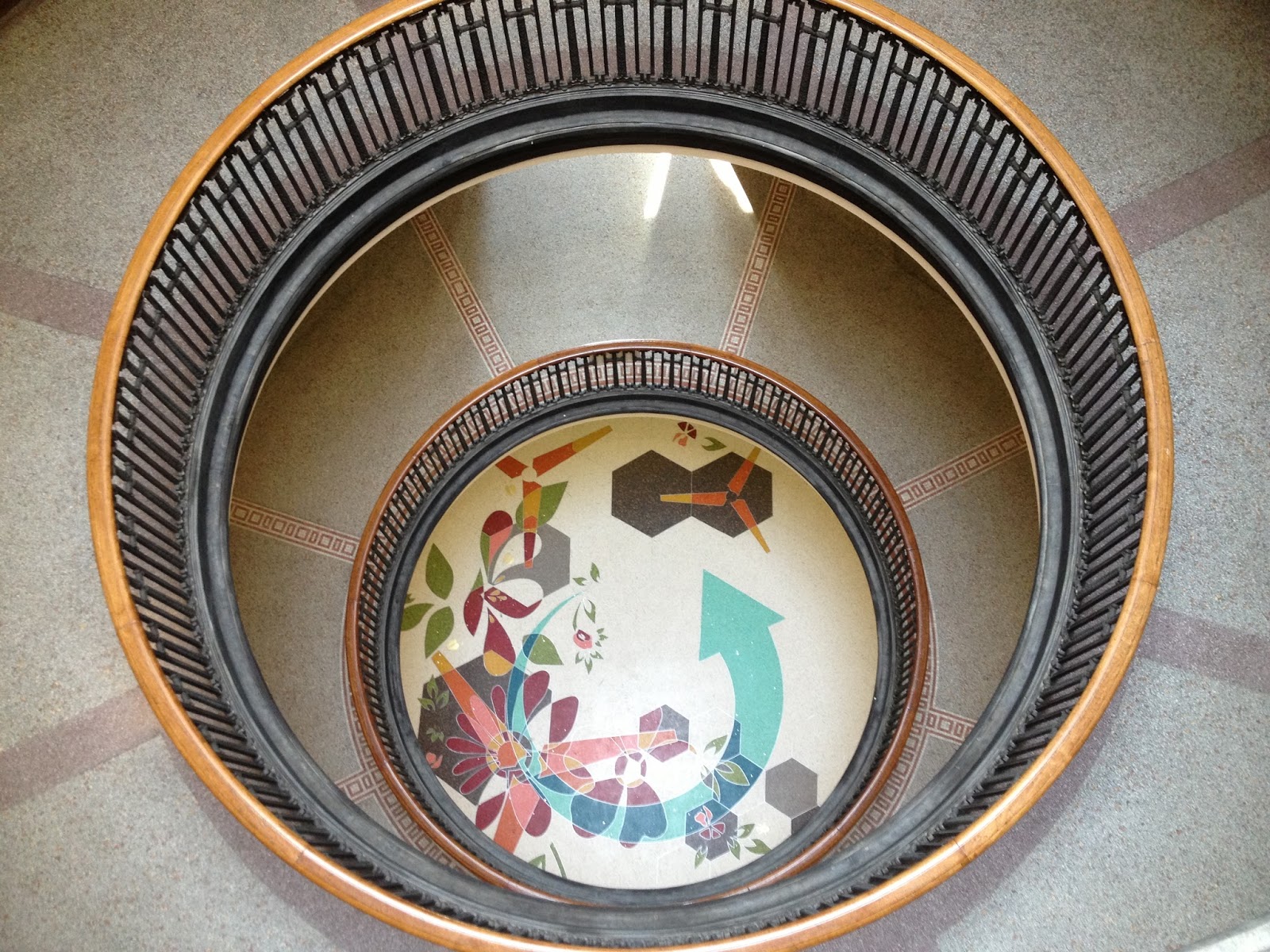
This is the fantastic terrazzo floor  surprise,
designed by Julie W Chang!

...looking down from 3rd floor.
I was not able to find an artist's statement as the floor has only recently been installed.  The dedication will soon follow.  I too, will follow with more information.

For me, it is a wonderful combination of organic and geometric shapes.  The balance of modern warm and cool colors, light and dark values, set on a "white" background displays great radial movement.  It tells a story of who lives here.  I love it.

....from the first floor.


Transparency at it's finest!


The intersections make it so interesting....
...and so complex.


What do you think the fan shape signifies?
Don't you love the use of the hexagons?
Is it a bug inlaid in gold?
Here's a link https://www.facebook.com/photo.php?v=621945307846237&set=vb.162721427101963&type=2&theater to a video so you can view the actual installation.

Thanks to Iowa State University for this fantastic installation.  Now if they would just paint their door aqua it would be perfect.  I'll have to email them.  'Till next Tuesday....


Tuesday, September 3, 2013

Paper, fabric and pencils, oh my!

Marny here...just a little bit of sharing this post.  Jill has given me a couple of things this week that I want to show to you all.  First, a special birthday card!

Look at these sweet little pieced blocks made from Carolyn Friedlander's Architextures.  Note Jill used a range of values, from dark to light, explored proportions, and had fun!  These are only 1 3/4" square.  Then she "quilted" them onto a card.  I like how the card looks against the cement.


But I also love how it looks in the "jungle".  The setting gives a different vibe to the subject matter, doesn't it.

Then I just have to share these Derwent Inktense pencils Jill gave me.  You draw or scribble with them like a pencil, then wash the pigment with a wet brush, leaving a permanent ink like effect.  You can use them on fabric, which means you can use them for quilting!  There is a non soluble "outliner" included too.  And white.  They can be gone over again once dry to layer colors and highlights and shadows.  So much to play with.  
So here was my first little experiment.  I chose what kind of followed the colors in the Architextures fabric.  The tip of the pencil is different from the color that results due to the nature of pigment/ink. 
A little wash of water.


Look how vibrant the colors are!


Playing with tones and value.

Now the more saturated and lighter is over the toned and darker.

Happy little trail.


Used the outliner here and filled in with pencil, then washed.  See the outline pencil is not soluble so it stays put.  I have always loved the look of pencil and watercolor.  The permanent ink wash here is so easy and the results are inspiring.
Thank you Jill!!

Till Tuesday...

Tuesday, August 27, 2013

Modern Squares for Flatbread Tablerunner

jill here.... Sometimes color combinations inspire translation.  While shopping with my daughter in Nordstroms, I was exposed to not only styles I've grown out of but new color combinations !  I'm so excited to see a resurgence of navy.  With a pop of color, it's spectacular.


Our pattern "Flatbread"
creates the illusion of transparency.
The medium light citron intersects (or overlaps)
with the medium grey to form a third, darker value navy.
The snow background contrasts for a vary graphic interpretation.


Four colors (and values) are perfect for Flatbread.
From Kona cotton solids I chose :
Zucchini (I will call it citron),
Windsor (I will call it navy),
Medium grey and Snow.
The range of values is good but the light, dark and dull really sets off the citron.  The added bonus for graphic display is that they are all solids.


Another bonus is the solids display the quilting pattern,
which gives a very flat fabric depth and interest.
April added her touch with a pantograph called
"Modern Squares".

At rest in all this heat!


Stay cool.  'Till next Tuesday...

Tuesday, August 20, 2013

Fabric Dyeing: Under Penny's Tutelage


jill here.... On a very recent road trip to Galesburg, Illinois I met up with our Funquilters (more currently named Quilters By Design).  Most of these quilters are Chicago based but Penny, Knox College retired professor, was willing to share her fabric dyeing talents. Initially, we showed our newest projects with lively discussion and of course, there was delicious food!  What fun to have the love and support of this shared quilting adventure.  It's always interesting to hear other's opinions on how to solve design/quilting dilemmas;  years of experience pays off with the buddy system.  Great food for thought and not a calorie consumed!  Later in the afternoon, we began our dyeing instruction.

First off, we had to choose two or three colors .  There were four of us dyeing so the process potential bordered on a colorful circus.  Penny reigned us in, remained calm and offered us direction.


Largely influenced by a Carol Soderlund  workshop.
 Penny maintains notebooks with the recipes.
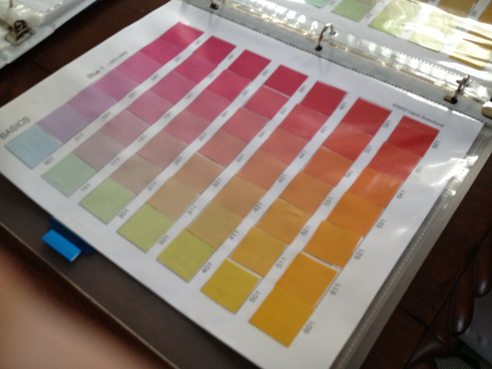
Mary Beth displays a swatch book :
this is one of three color reference guides
with the codes to create the colors. 
A page from the guide..
Janis contemplating color possibilities.
This is not an easy decision!

That's the perfect one!

After nourishment, we moved to the basement "wet studio". To help the process along, Penny soaked the laundered fabric in soda ash;  this changes the ph of the fibers to better accept the dye.


Sharon contemplates a bucket of soda ash.

Jill saving the soda ash solution for another day.

Penny begins the mixing.  It's a very accurate process
based on weight (the dye) and volume (the liquid) in
relationship to the amount of fabric being dyed. 


This is truly a test of math and science....
two of those subjects many of us try to avoid.
If high school had only used it in this context!


The application begins...

The massage is important for over all saturation!


Janis smiling through the 15 minute massage.
Her arms and hands had a workout with the indigo.


Sharon chose a slightly different process.  Penny assists folding
the extra large backing fabric.  


On top of the plastic covered ping pong table, they begin
pleating the fabric.  This will create vertical striations.

The fabric is scrunched to a manageable size (well, sort of).


Sharon began the dye application , starting with the blue.
She added a green and a teal to complete this design.
The coverage will have variation and bleeding of the analogous colors,
based on the folds and saturation.

The covered fabrics remained in their baths overnight.  In the morning, Penny rinsed the fabrics in preparation for the final cleansing.

The utility sink proves invaluable to these messy experiments.


Looks like it worked!


All the multicolored fabrics were rinsed and laundered together.
A small amount of liquid detergent was added to the
final wash/ rinse.
Once the fabric was slightly damp dried,  we operated
Penny's mangle.  A blast from my past, this creature
pressed it all in less than a minute.  Who said our mothers
weren't efficient?  

Sharon's whole cloth quilt!  TA DA!


Clothes line beauty in idyllic Galesburg.


Goddesses of beauty! 

Thanks, Penny for another addictive adventure!